
>> SCROLL DOWN FOR MORE IMAGES <<
A fresh new look.
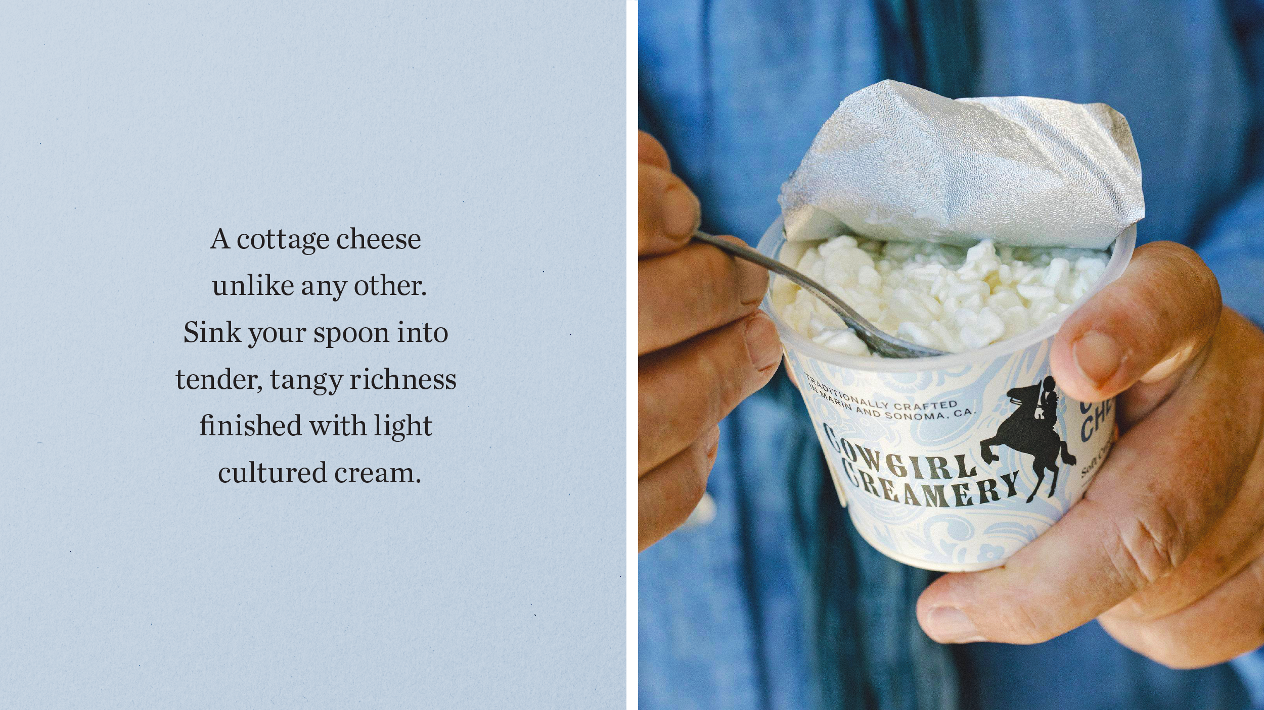
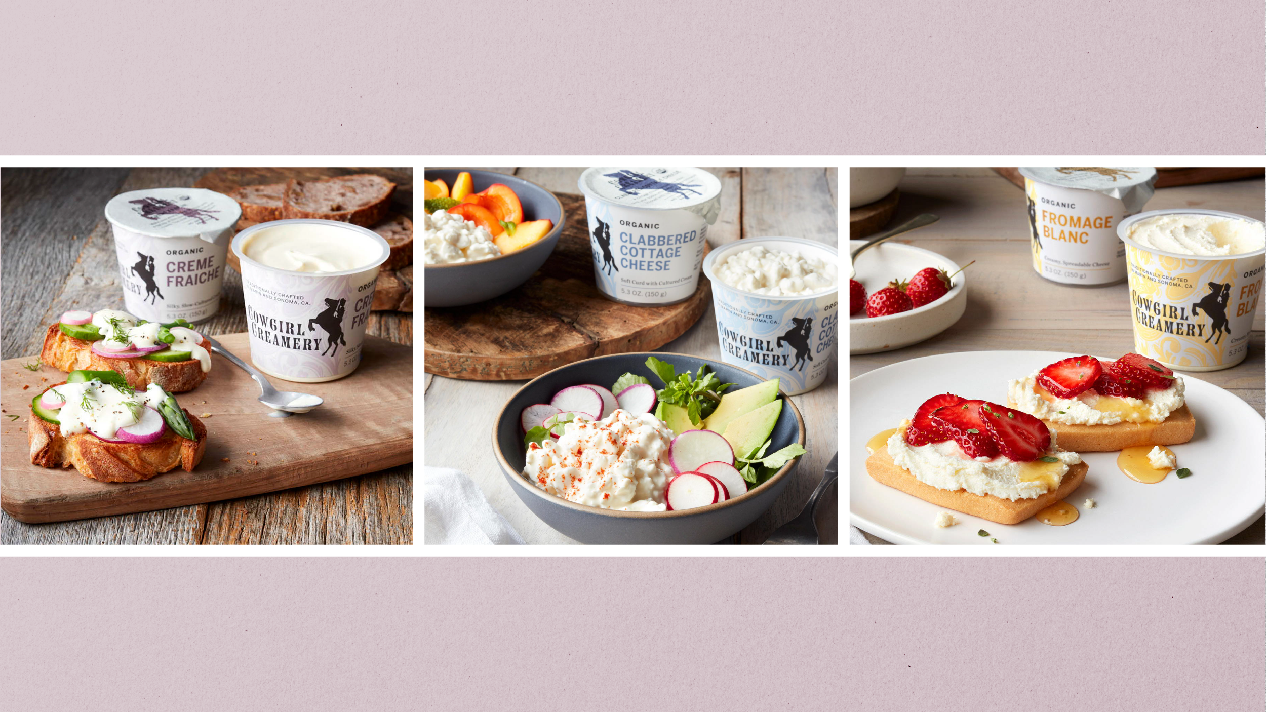
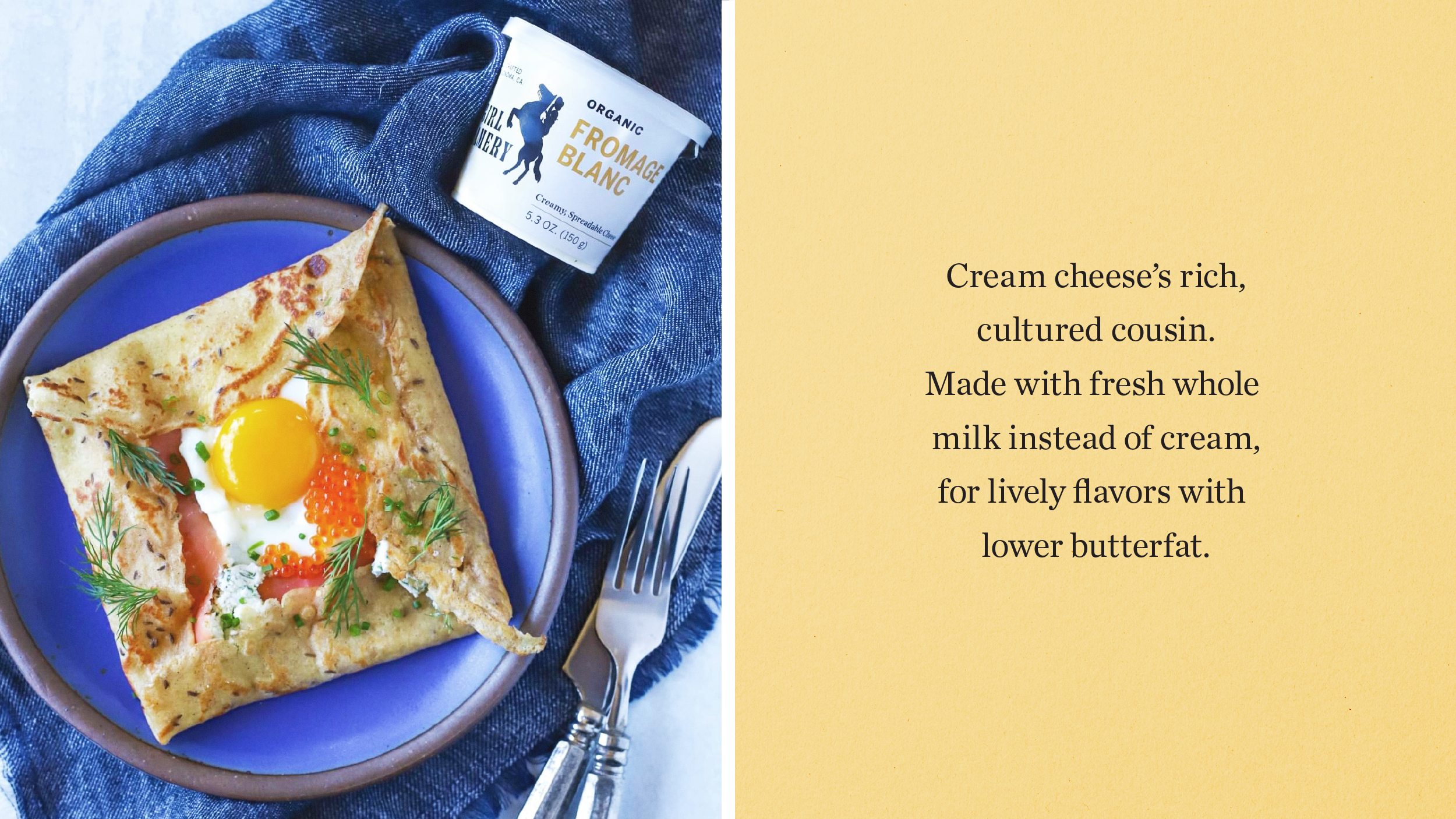
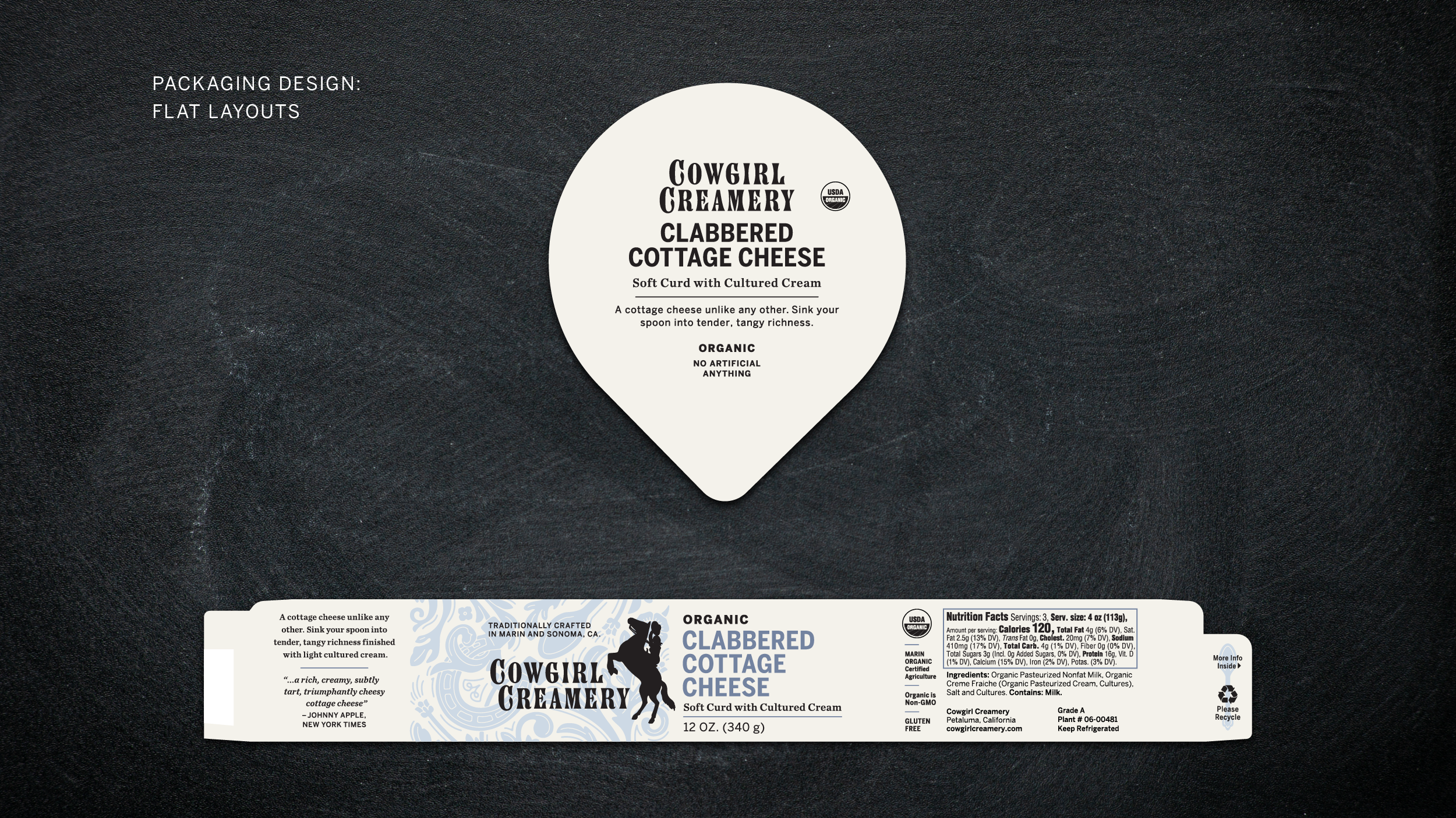
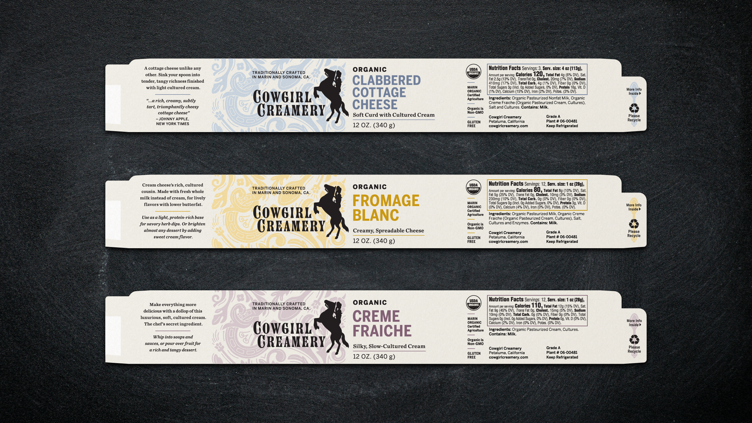
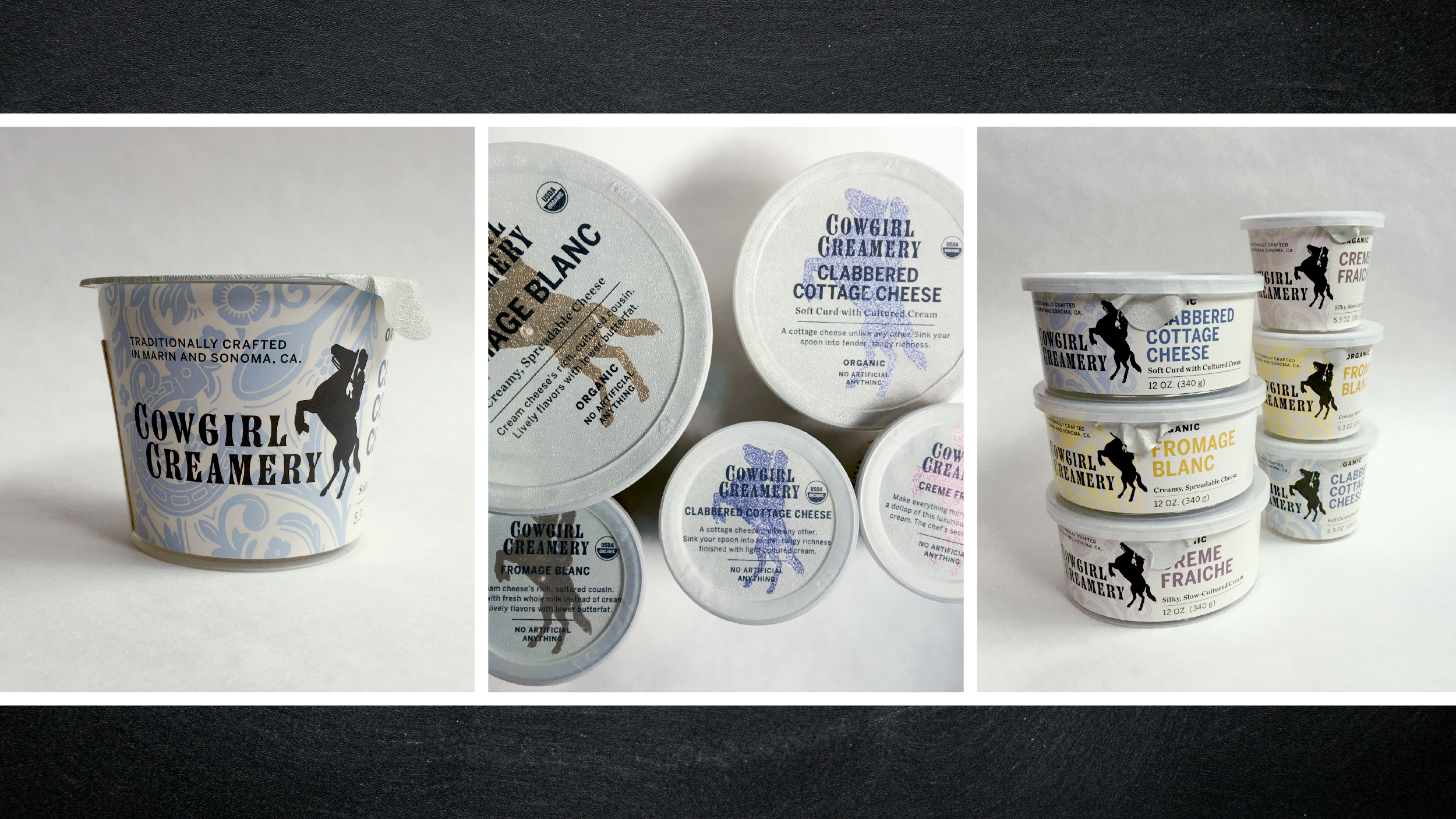
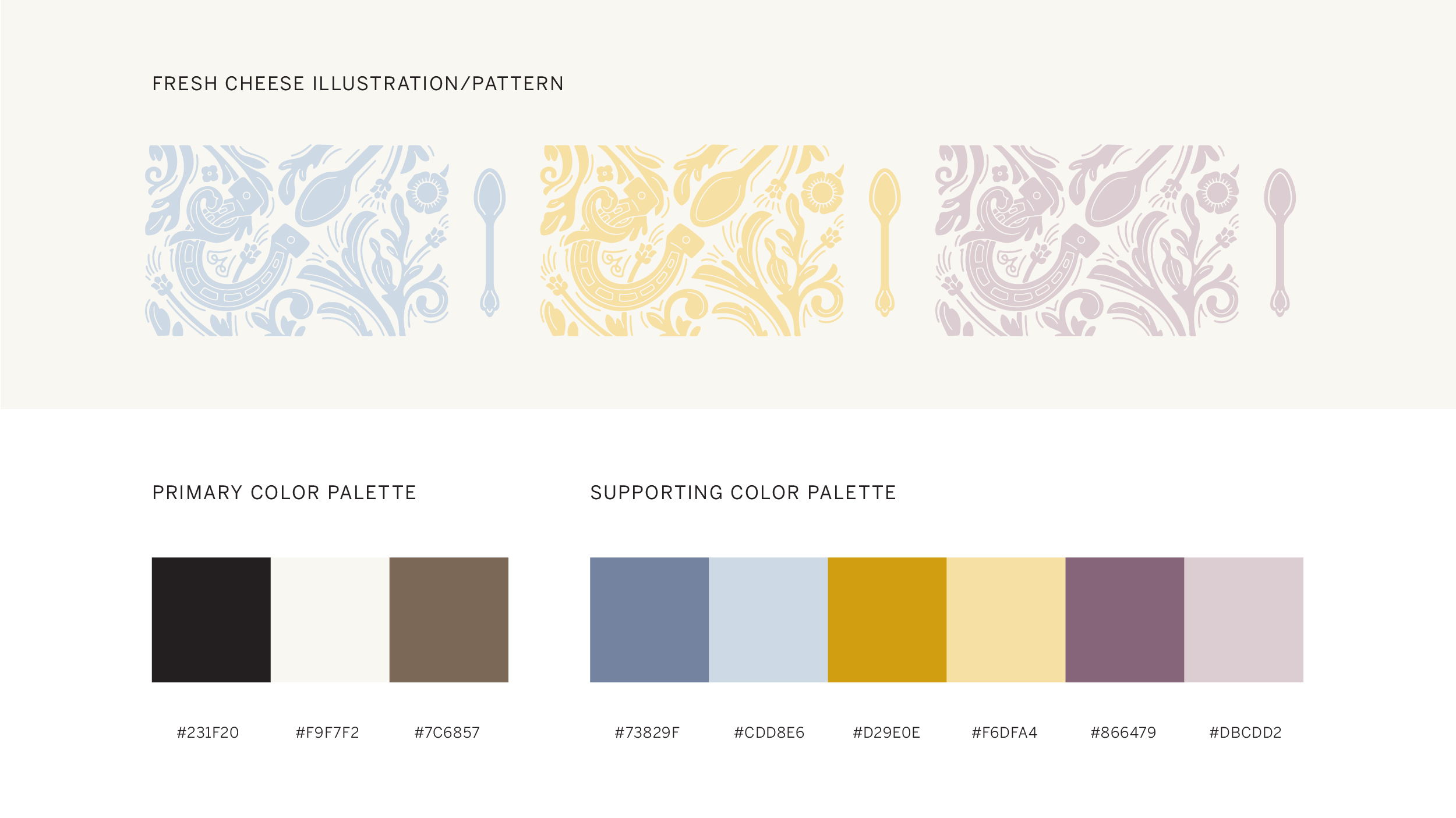
Cowgirl Creamery's fresh cheeses are an assortment of stand-out, award-winning cheeses. Using only organic and sustainable agriculture – with locally-sourced ingredients, and painstaking methods – they're an edible celebration of the best California artisan foods have to offer.
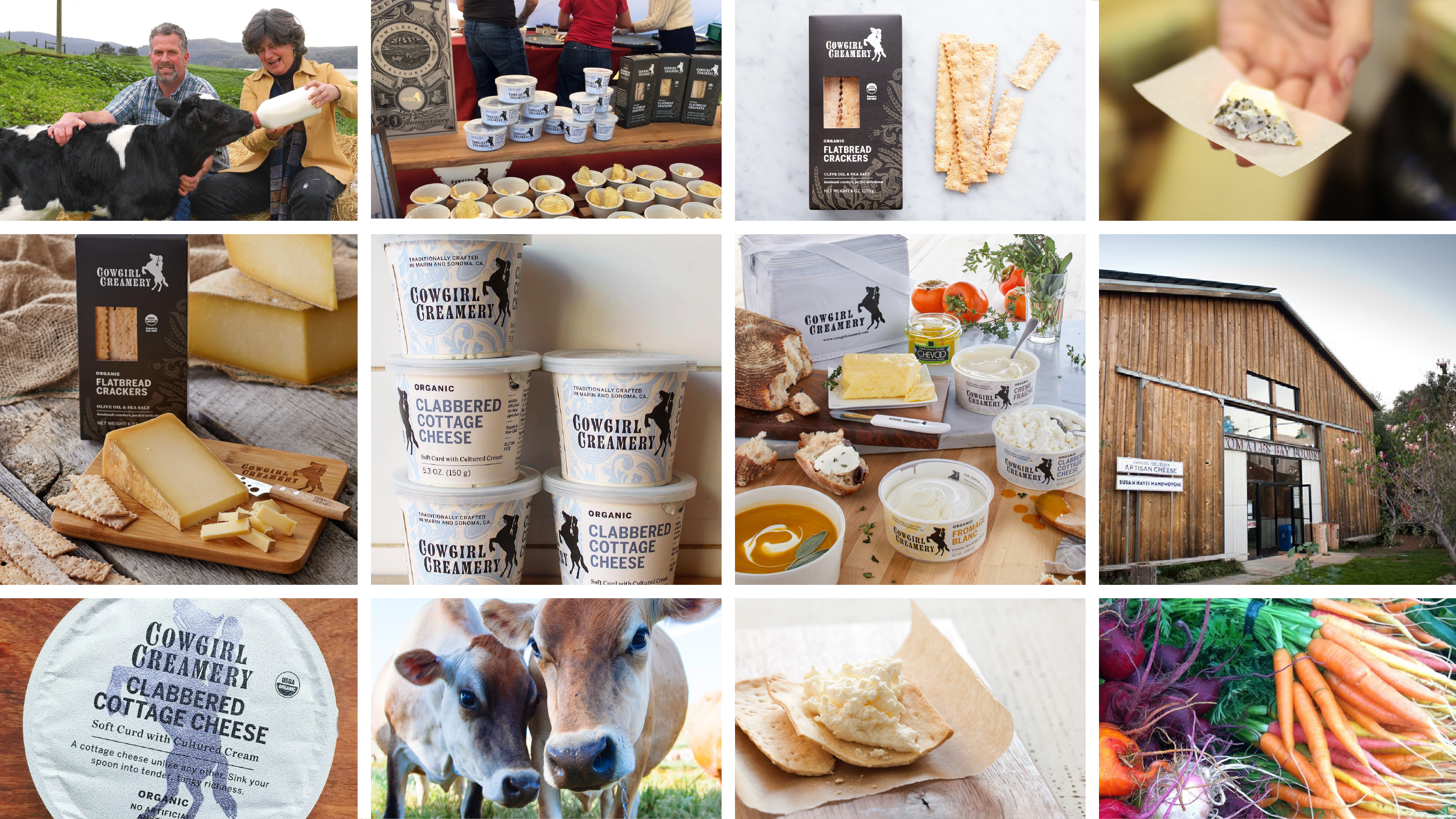
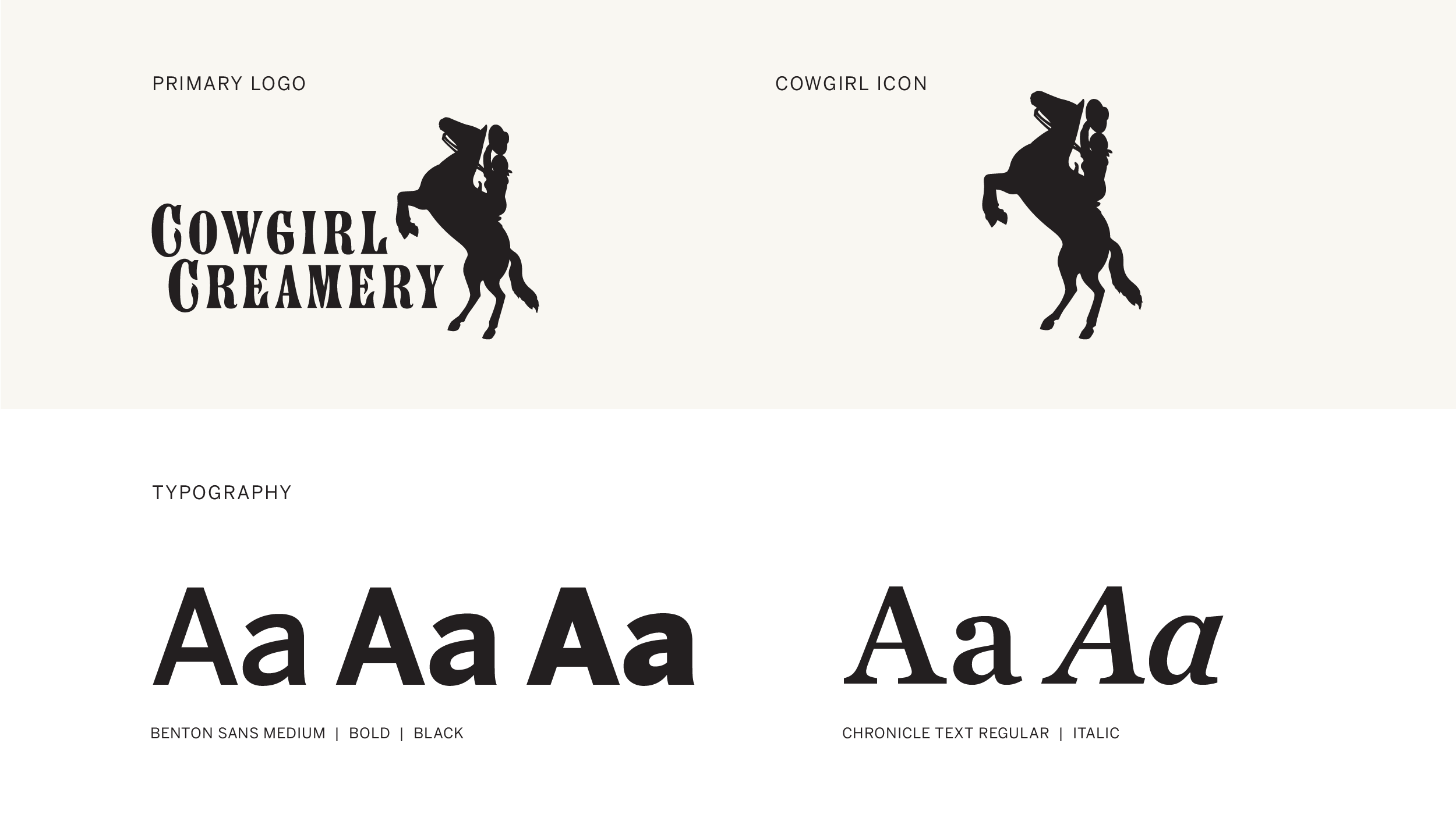
Working with the Workyard SF, we evolved the brand (refreshed their existing logo and icon) and redesigned their fresh cheese packaging to lean into the idea that these artisan cheeses are fresh, creamy, and light. We also extended the design to their flatbread cracker boxes, shifting the color to a darker palette.
We wanted to differentiate from their more traditional, aged cheeses. We were also mindful that their growing international brand needed to retain that small-town, artisan cheesemaker feel that their customers had come to know, trust & love. Their essential brand spirit is kind of like “Dolly Parton playing Carnegie Hall" – MaryKate Meyerhoffer.
"The sparkling logo on top is just us Cowgirls, having a little fun and standing apart from the crowd. We take our cheese seriously, but not ourselves." – Sue Conley, Cowgirl Creamery Co-founder
BRAND & IDENTITY EVOLUTION | PACKAGING | COPYWRITING | PRODUCTION
STUDIO: THE WORKYARD SF | CREATIVE DIRECTION & CODESIGNER: MARYKATE MEYERHOFFER | ILLUSTRATION: JOSH DIAZ