>> SCROLL DOWN FOR MORE IMAGES <<
Bold protein for big workouts.
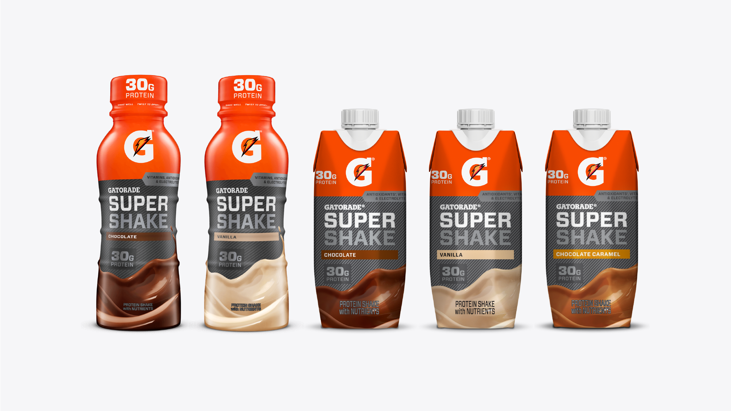
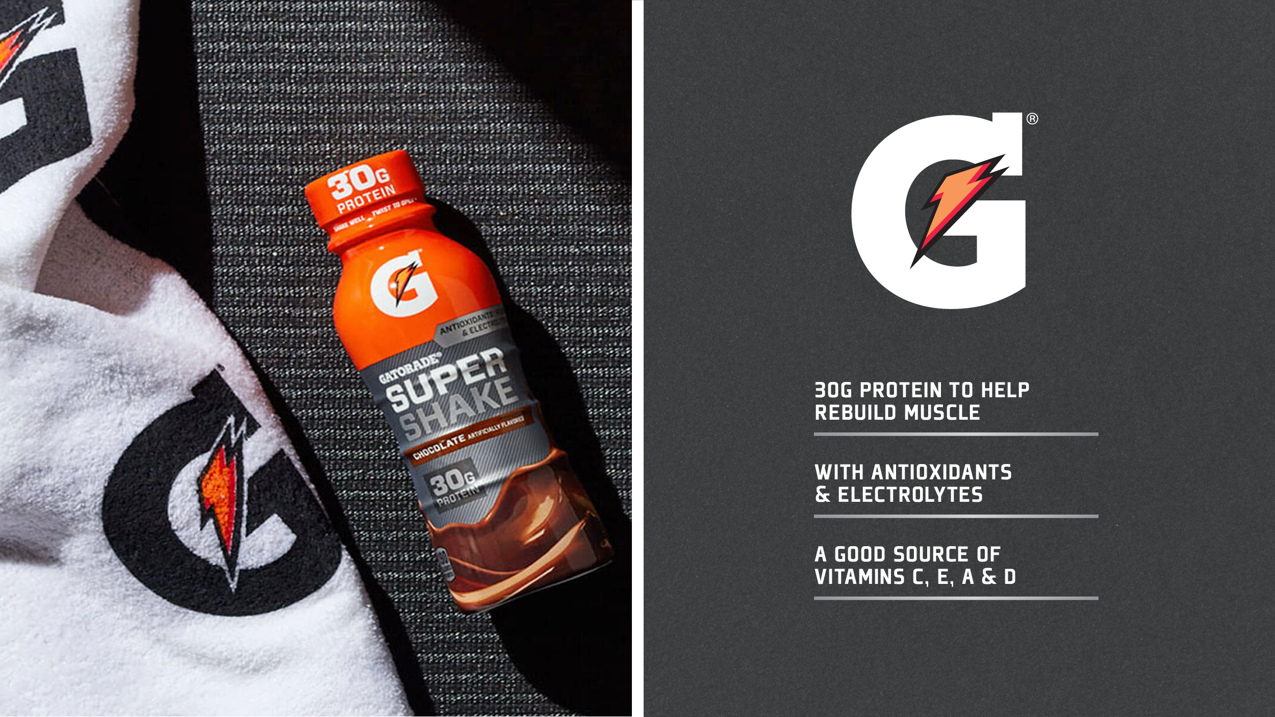
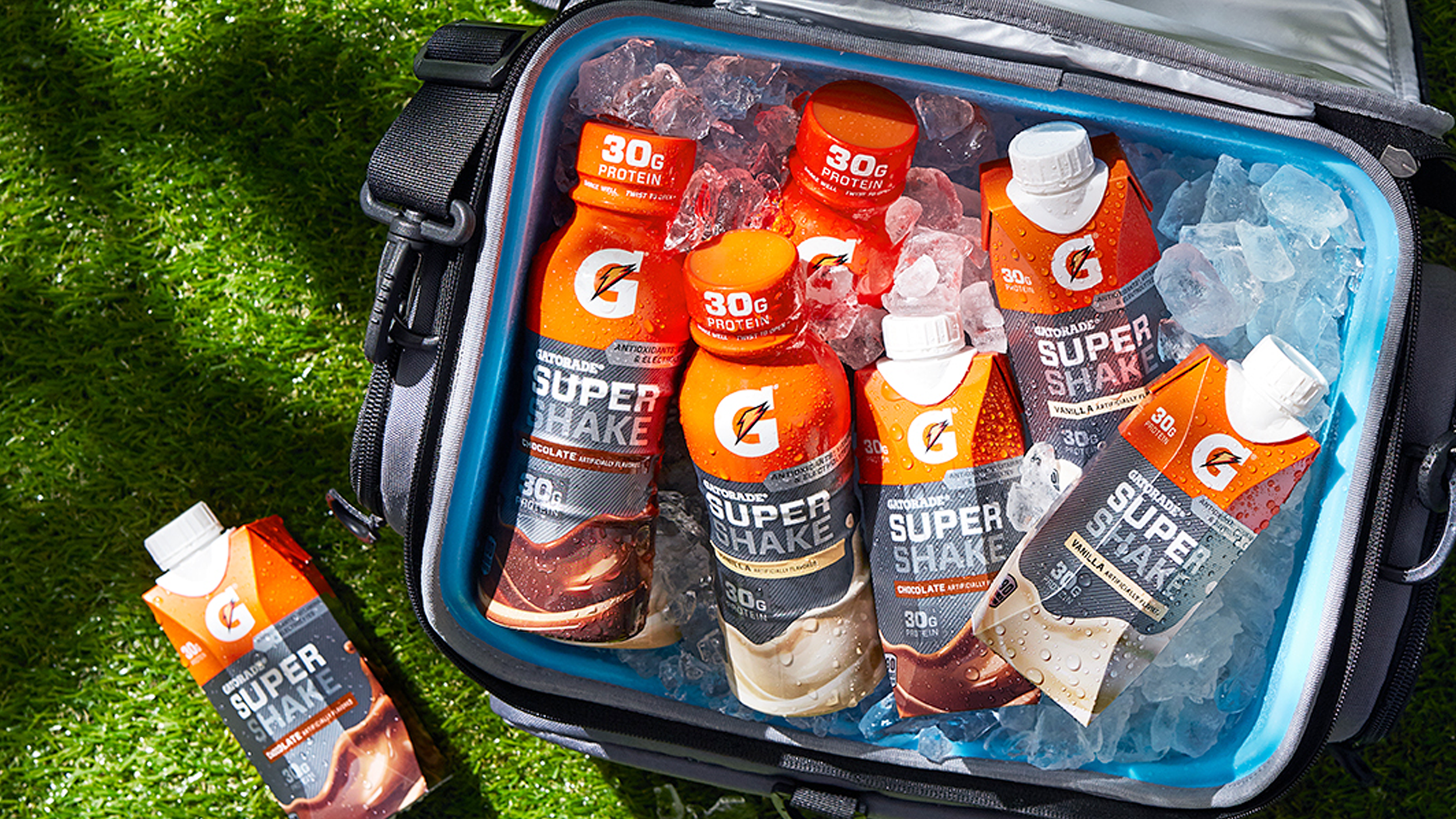
Gatorade Super Shake is a high-quality protein shake featuring 30 whopping grams of protein, and the vitamins and electrolytes athletes need to fully recover from grueling workouts. G Super Shake is a bold, flavorful recovery supplement that is ready on the go.
While working at Tether, we designed the packaging for this new product in the Gatorade line-up. We created a packaging system that lives well within the existing Gatorade brand but also steps into a new, protein-driven space. The packaging system features the G Bolt and their signature brand orange. We used bold typography and metallics to move towards a place that felt more intense and technical. We wanted to speak to a core audience of athletes doing weight training and exhaustive workouts in the gym. Because G Super Shake is a ready-to-drink product that tastes great and has a pleasant, smooth texture – we also played up its flavor communication. We did this by adding a color-coded flavor capsule, and a dominant flavor wave that sweeps across the pack.
IDENTITY & PACKAGING DESIGN
STUDIO: TETHER | CREATIVE DIRECTION: DANIEL PETRZELKA | CODESIGNER: JAMES LAFUENTE