>> SCROLL DOWN FOR MORE IMAGES <<
Protein for every body.
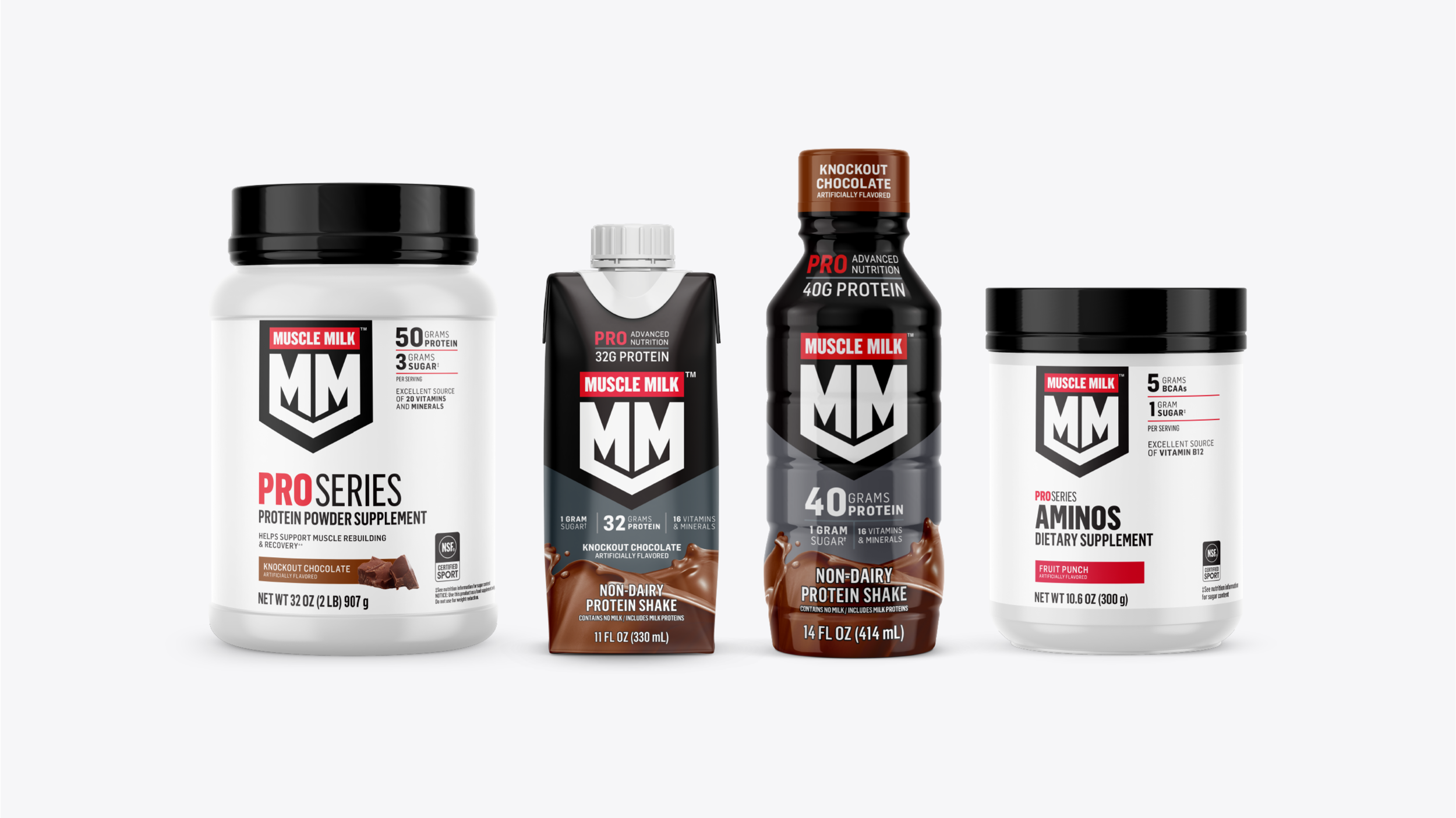
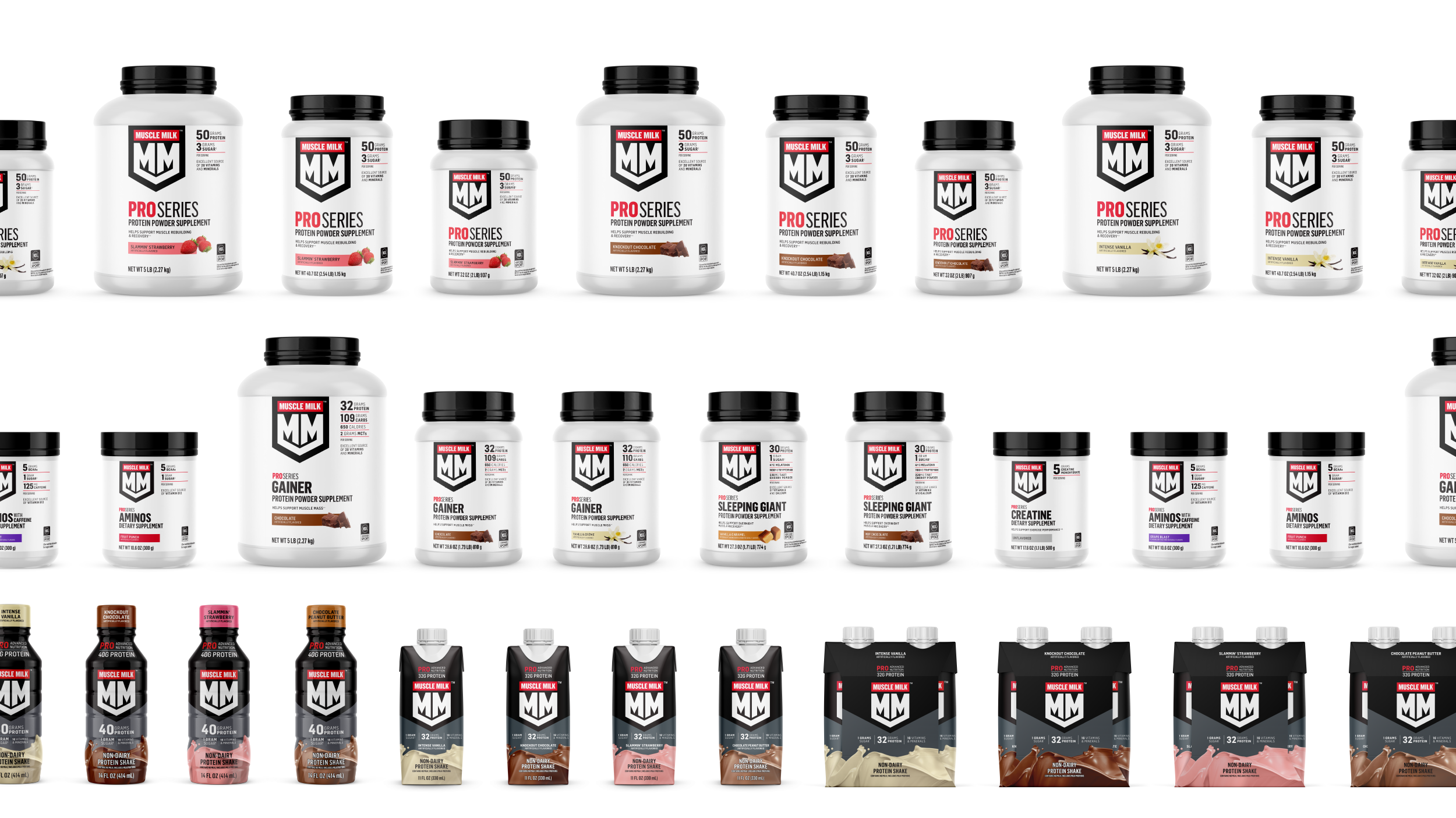
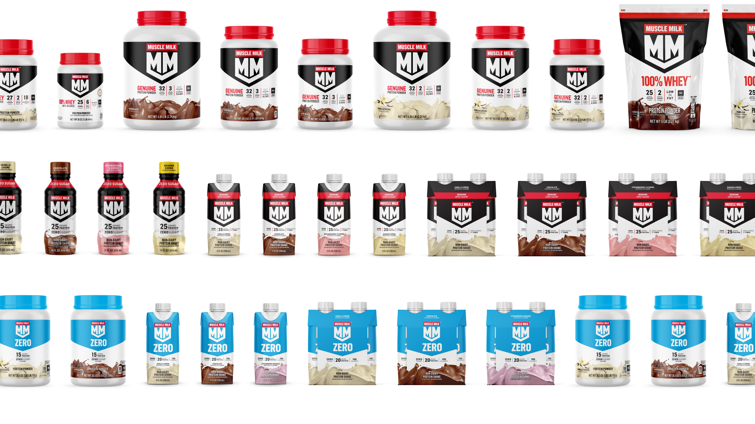
Muscle Milk is a line of great-tasting protein supplements, available both as ready-to-drink and powder mixes. They've been a long-time industry leader in the protein supplement world and have great overall brand recognition. They have a large and ever-expanding portfolio of sports nutrition products for an evolving and broadening fitness-driven consumer base.
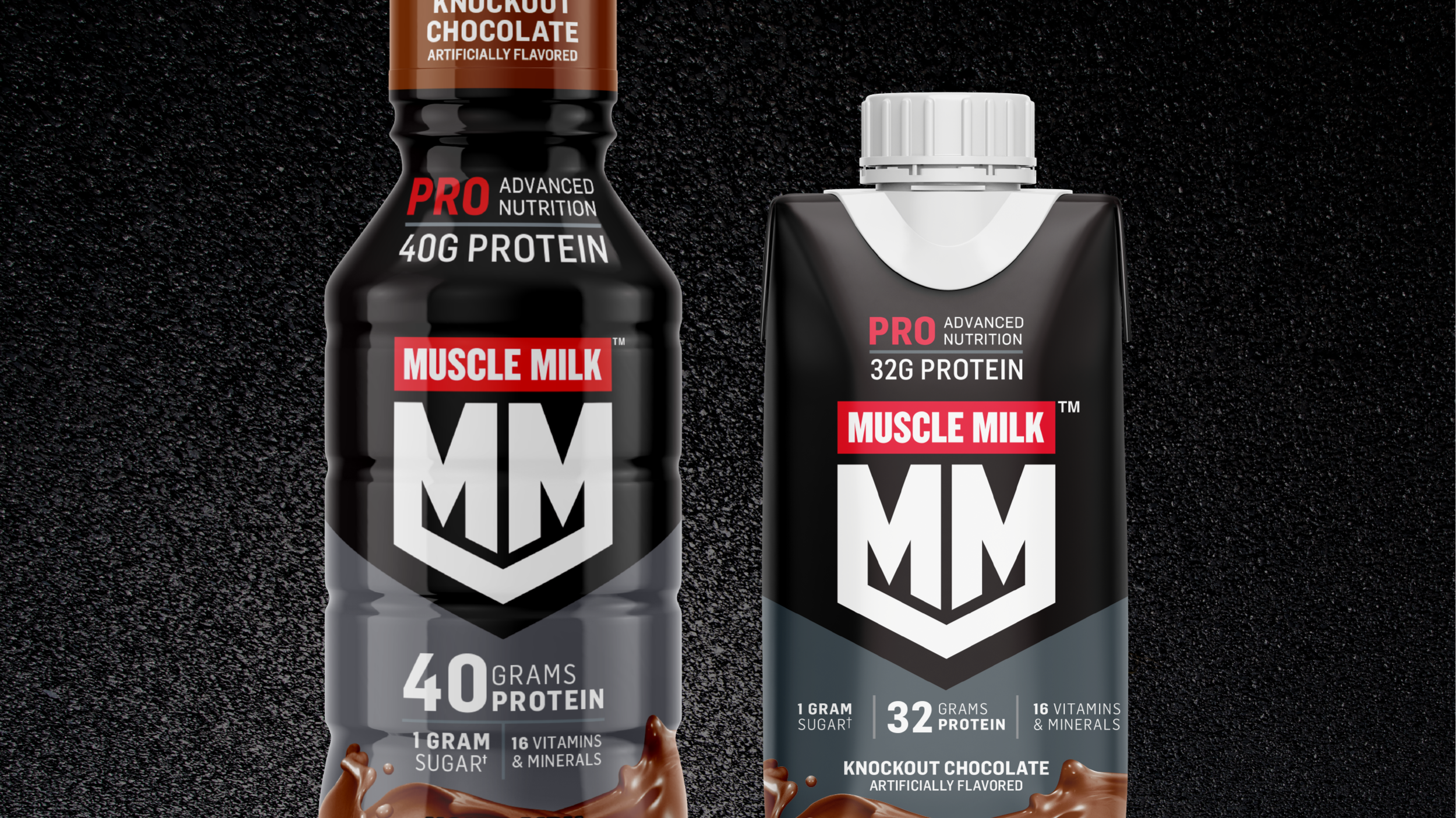
While working at Tether, we got the chance to evolve their brand and packaging: to create a packaging system that could grow and flex as they introduce new products and target emerging categories. The new packaging system needed to keep some of their existing core elements, but also needed to move them into a space that felt more premium and modern. It was important to retain some components of their current brand packaging, and also create a new packaging architecture that felt more systematic and intentional.
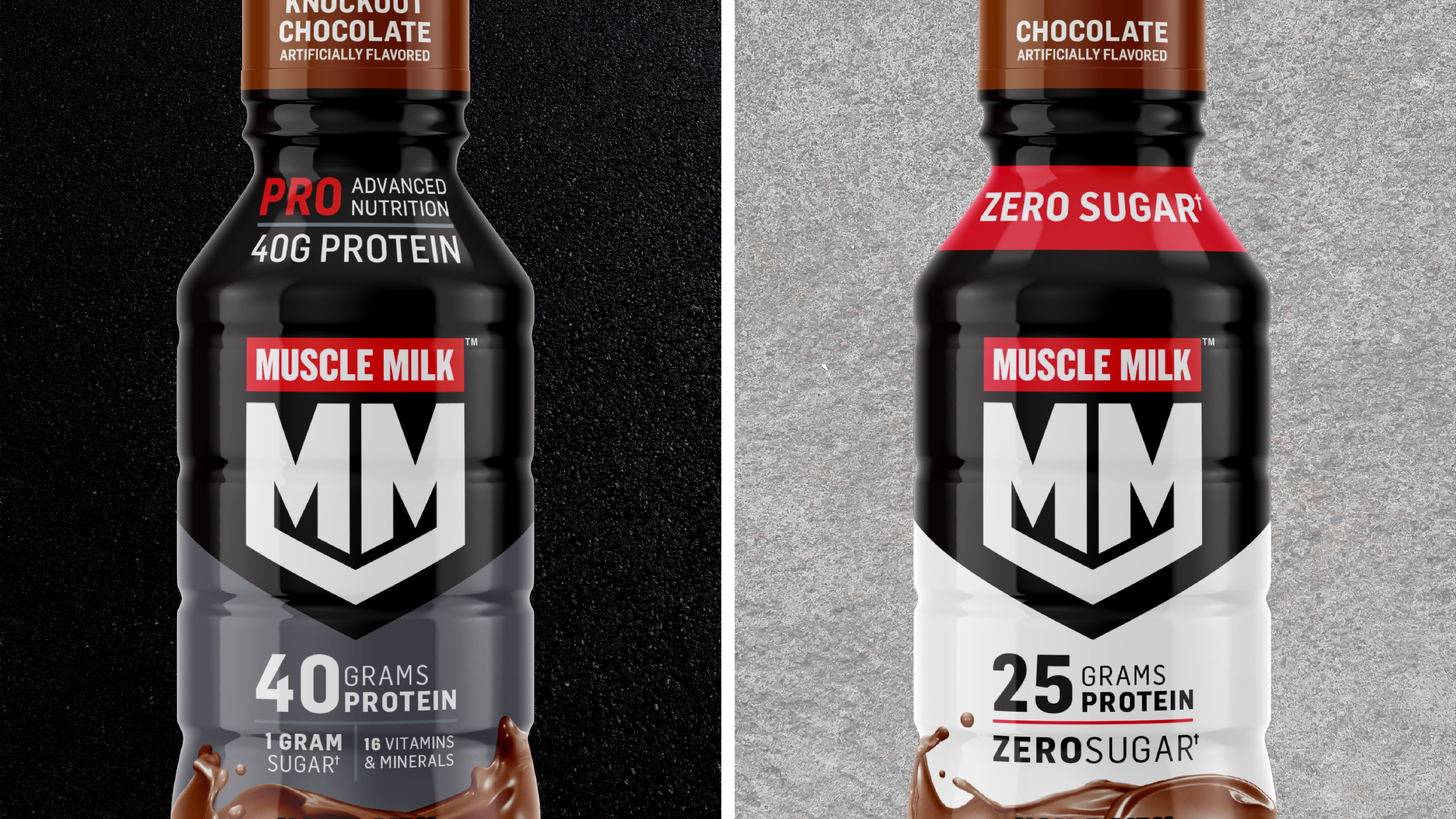
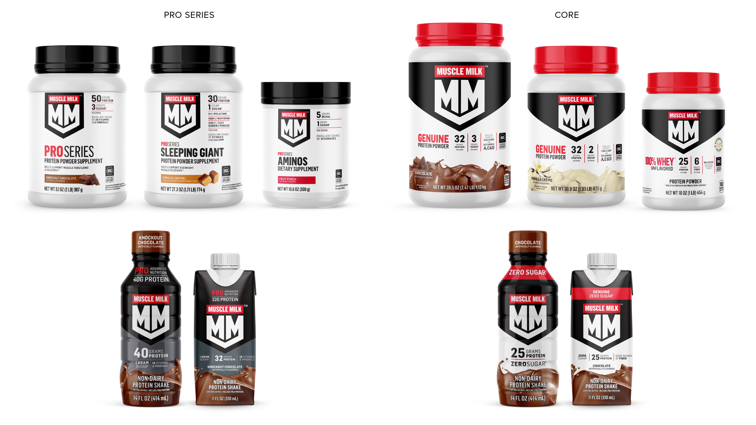
We used their new monogram logo, replacing their old wordmark: an exciting approach that feels bold and confident. They also wanted to create greater differentiation between their CORE and PRO line-ups. The CORE product line feels more inclusive and approachable – while the PRO product assortment feels more premium and specialized. We also gave guidance on their overall product architecture: working closely with their internal team to best strategize how to distinguish between sub-categories within product sub-brands.
IDENTITY EVOLUTION | PACKAGING DESIGN | PRODUCT ARCHITECTURE
STUDIO: TETHER | CREATIVE DIRECTION: DANIEL PETRZELKA | CODESIGNER: JAMES LAFUENTE